nomad
We tapped into our dreamy bohemian side for this branding project. nomad, a small chain of boutiques, stocks clothing, accessories, and private label beauty & wellness products with a natural, earthy, global feel. With worldly and handmade as our watchwords, we looked to sources in art history and created a tight identity, consistently executed across all points of sale.
Scope
Naming & Tagline
Logo & Secondary Marks
Messaging
Brand Guidelines
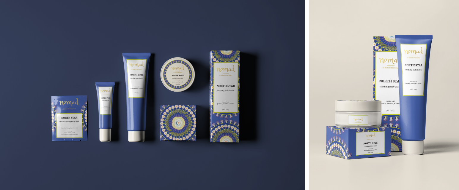
Packaging
Stationary Collateral

A modern look grounded in the old world
Looking to historical women’s handiwork, we developed a logo inspired by antique lacemaking patterns. Added in a touch of European town square and dash of Moorish decorative motifs. Think market day by the cathedral square on a hot Mediterranean summer afternoon.
These references, along with the tagline, tap into nomad’s core values of appreciating the handmade, travel and exploring cultures.
COlor & Typography
Rich colors and a touch of gold, offset by the simplicity of kraft paper, along with a serif font keep it in the mood.


Packaging
Keeping the same color palette, we created a repeating medallion pattern influenced by Indian wood carving, extending it across three colorways for the packaging of nomad’s range of beauty products.