

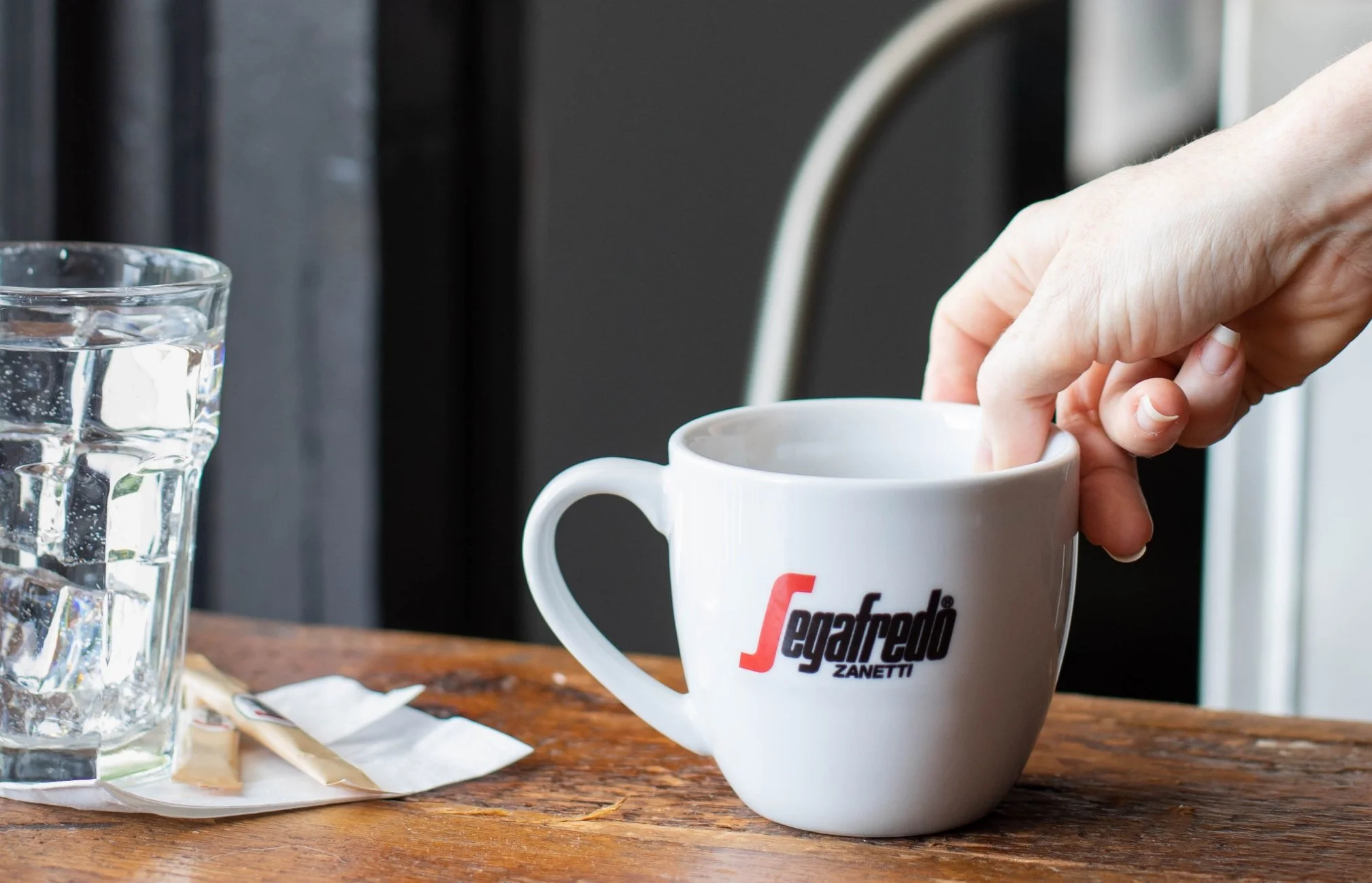
Segafredo Zanetti Foodservice Identity
Massimo Zanetti Beverage USA’s foodservice division had launched in North America a few years prior and this global coffee company was in the process of shifting their messaging and look towards a non-European audience. We worked with their team to align disparate elements and create a cohesive, fleshed-out identity. The division operates under the Segafredo Zanetti name and we used the established logo and core colors as a starting point to develop a casual, approachable feel that is versatile enough to speak to their full range of Away-From-Home B2B coffee customer profiles.
Scope
Creative Direction
Brand Identity System
Brand Guidelines
Messaging
Typography, Color Palette, Voice
Photoshoot Creative Direction, Production, Styling
Supporting Collateral & Marketing Pieces
Credits
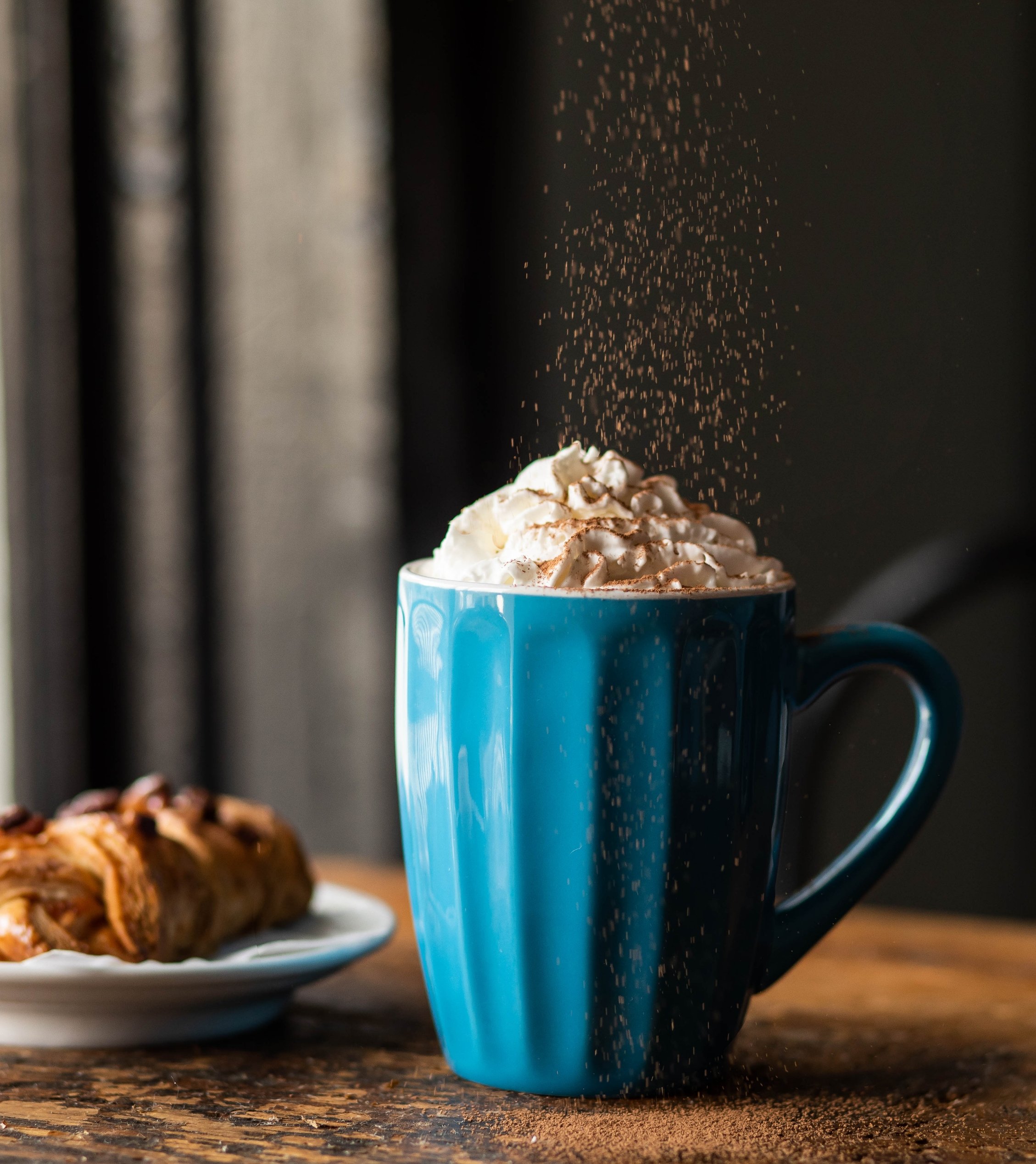
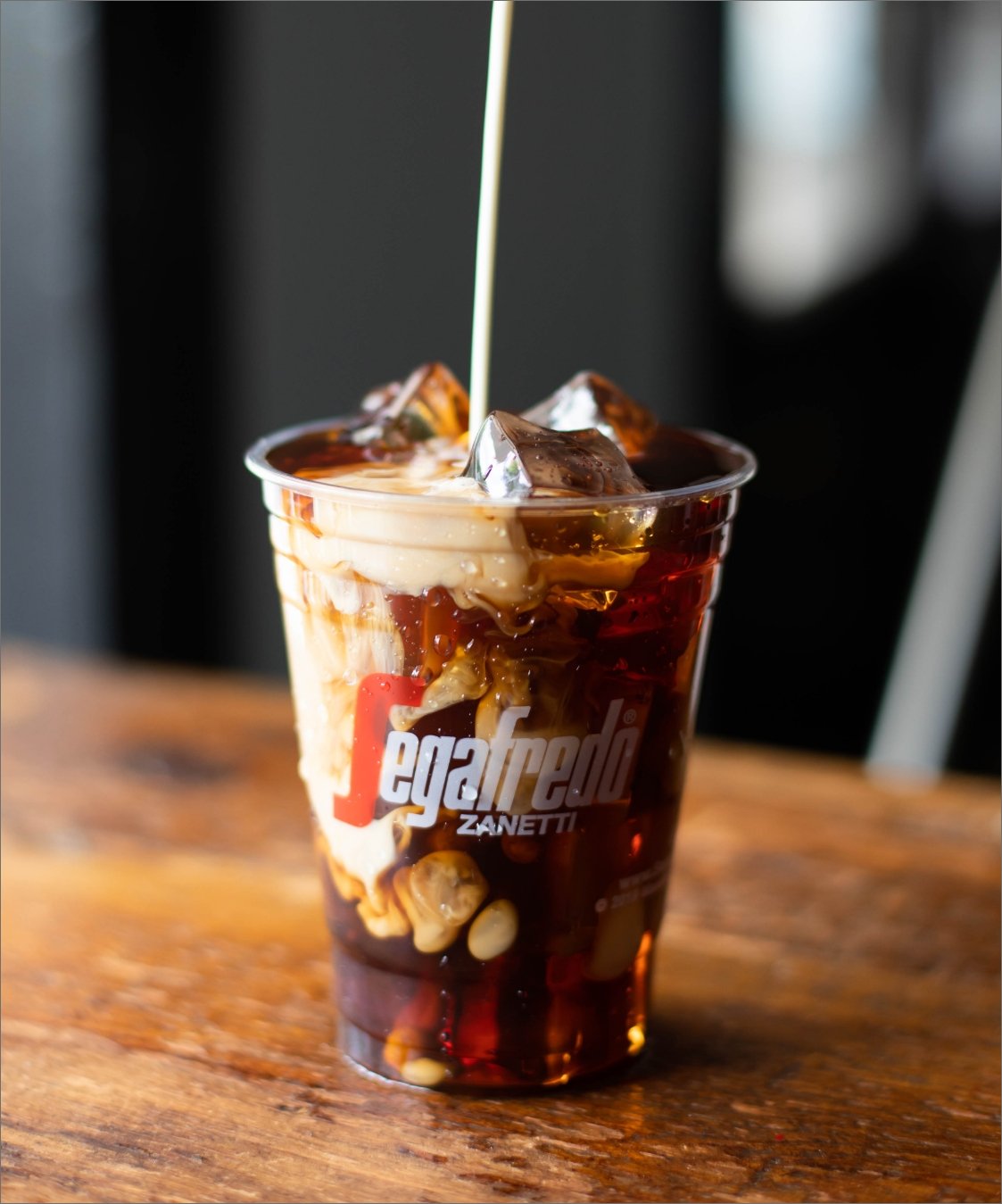
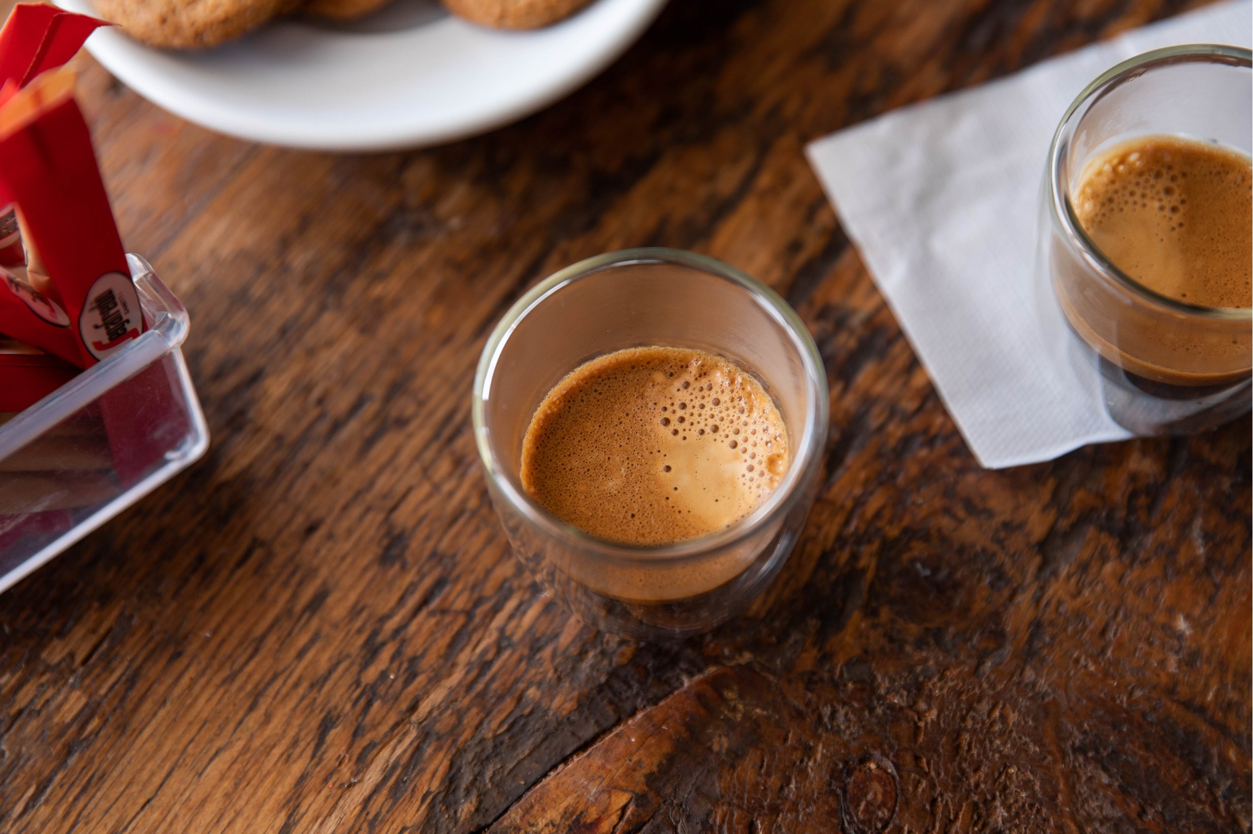
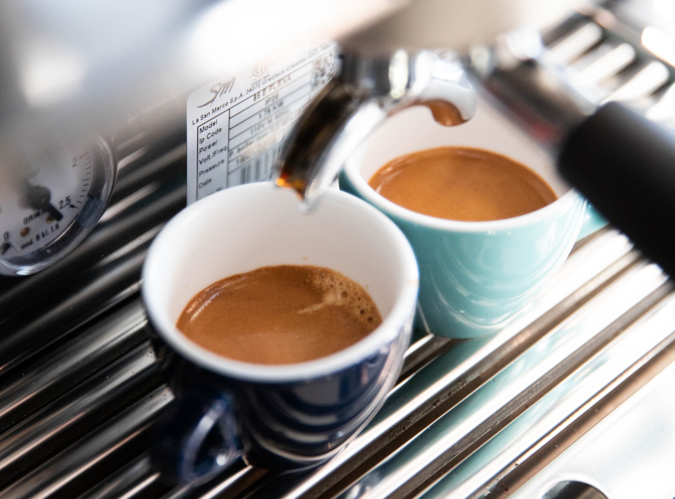
The amazing Kathleen Fox Photography got us a ton of delicious shots.

If it ain’t broke
During our research phase, we mined a trove of past collateral, reading up on previous brand statements, presentation decks, company history, product descriptions, and launch materials. Obviously the primary logo, with its brand equity, was staying.
The Segafredo Zanetti wordmark is forward leaning, dynamic, and strongly influenced by Italian futurism and the Italian cycling culture of tossing back an espresso and getting out on the road. This version of health was not jiving with audiences here and particularly not with the B&I customers the team was aiming to target.

Fix what is
Working closely with their marketing team, a new brand personality was developed. Then, we boiled everything down to a succinct mission and brand statement, approved taglines, key facts and a division specific message.
We developed a new Foodservice logomark that uses their distinctive “S” and started putting the new identity together.

Vibrant & strong
Armed with this new vision, we juiced up the existing core colors with a palette of saturated options that can balance the strength of the signature red.

Clean, simple typography was chosen to tone down the somewhat aggressive feel of the logo. In the interest of continuity, in the final guidelines, we included several font treatments and layout suggestions, since there was potential for a variety of people to be creating content using this system.
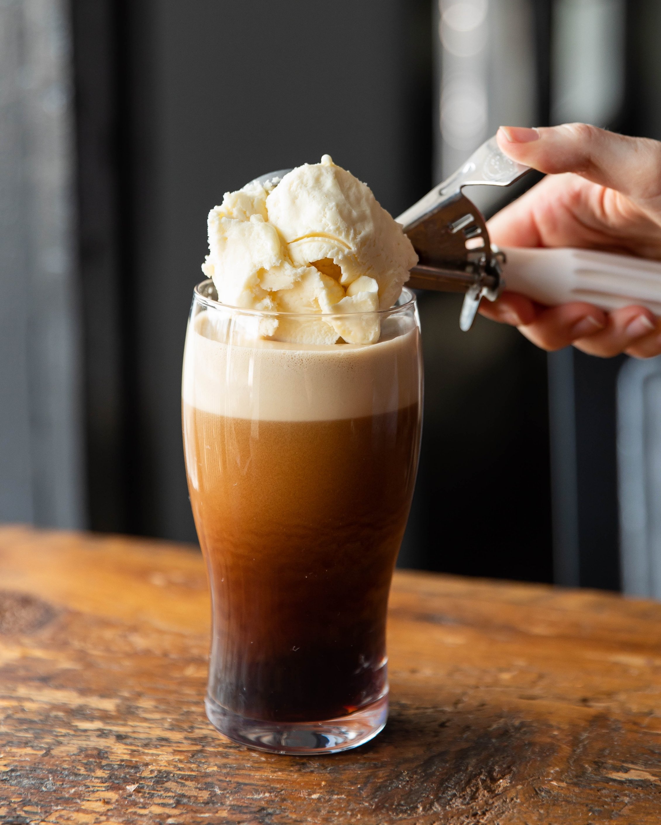
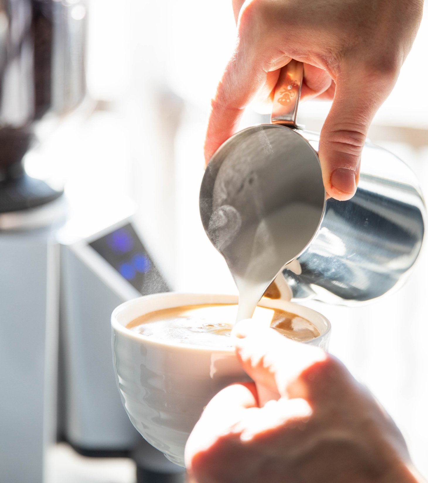
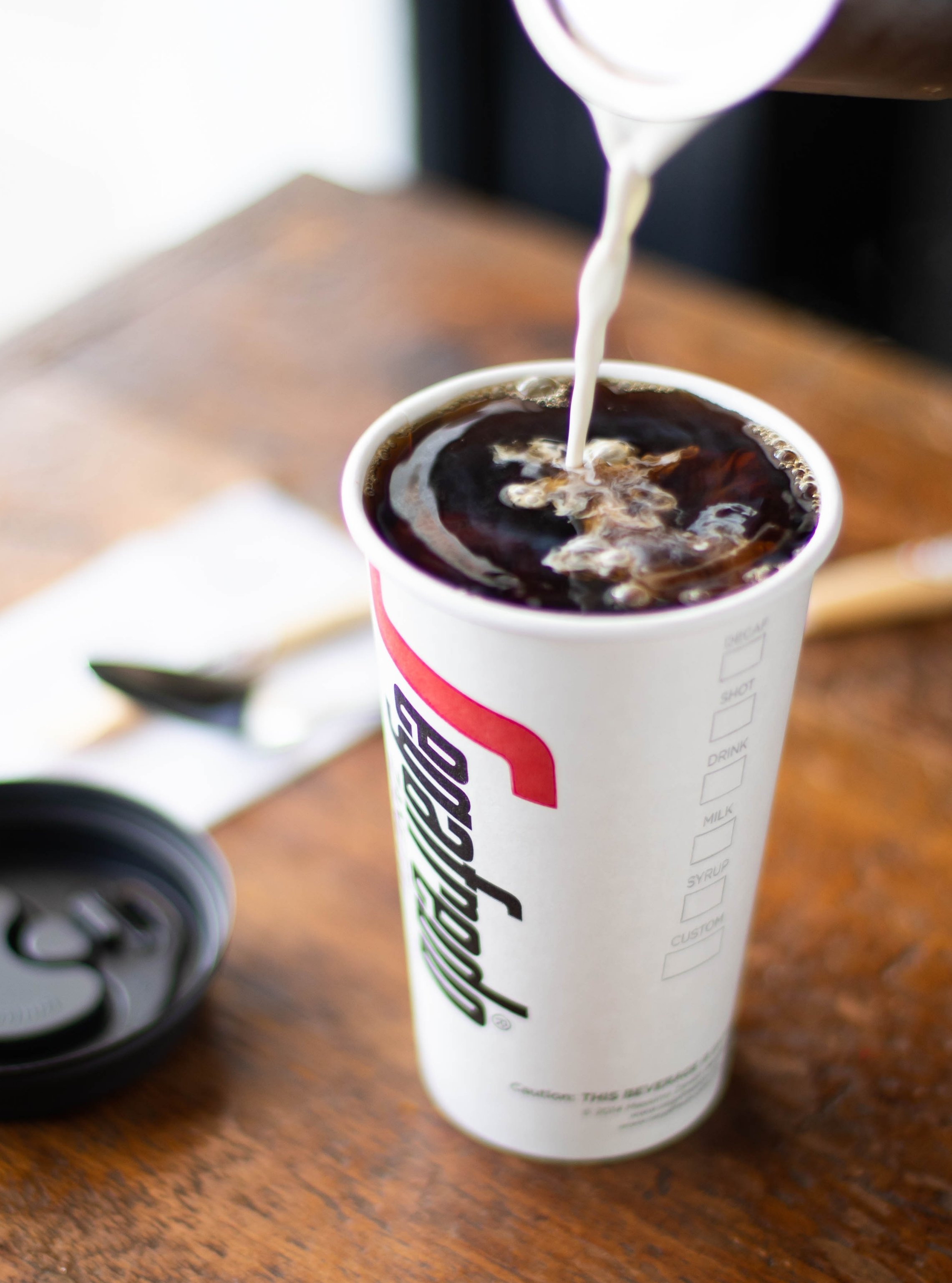
Creating an Extraordinary Cafe Experience
To make the product come alive we needed a portfolio of enticing pictures. They had a small suite of images and some product shots, but you don’t buy beans per se, you buy what you can do with them. To capture the rich experience of drinking a flavorful, premium coffee beverage, and to illustrate for operators that their customers will think better of a location serving Segafredo, we directed and produced an on location shoot.


Brand Guidelines
All the components developed and produced, we wrapped everything up with guidelines, suggestions, and examples into digital and spiral bound versions of the Brand Book, ready to be put to use.
Selected pages below.
