Red Oak Ensemble
Nurturing new and emerging musicians by providing exposure and support, Red Oak Ensemble needed an identity that communicated their mission. We were happy to get to work with them to create a simple identity system that would grow with them and their roster of cutting edge yet classic artists who are at the start of something big.
Scope
Branding
Illustration
Logo & Secondary Marks
Simple Style Guide
Stationary Collateral
Merch
Taking cues from the Red Oak name, we developed an identity featuring a hand-drawn logo. This sweet sapling illustration was hand-drawn with pencil, inked in micron pen, and then vectorized for reproduction.
Digital music, Made by Hand
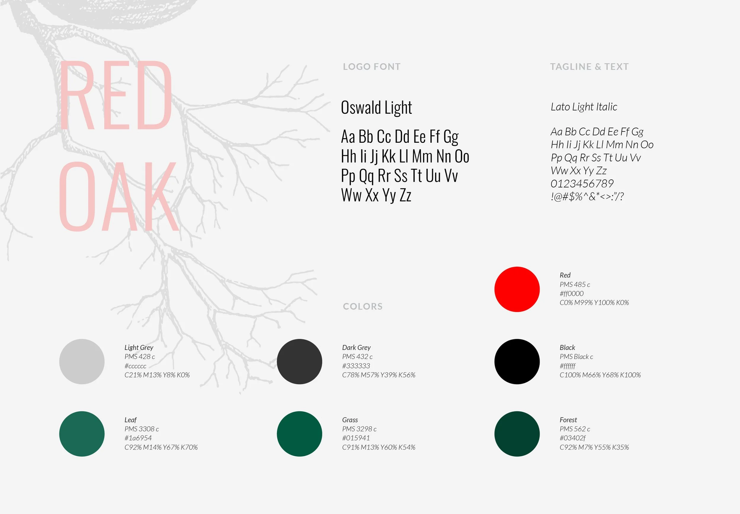
We wrapped it all up into a simple style guide with open-source, web-ready fonts, a bold yet “forest-y” color palette and a logo system that can grow with them.


